Using Color to Evoke Emotion in Your Travel Photography
12 November 2026
When you're scrolling through Instagram or flipping pages in a glossy travel magazine, what makes a photo stop you in your tracks?
Is it the subject? The location? Or maybe, just maybe… it’s the color.
Color is one of the most potent tools in a travel photographer's toolkit. It doesn’t just make your shots prettier—it tells a story. It sets the mood. It sparks emotions.
Whether you’re snapping epic landscapes in Patagonia or capturing quiet street scenes in Kyoto, understanding how to use color deliberately can take your photography from average to unforgettable.
So let’s dive deep into how you can use color to evoke emotion in your travel photography. No fluff—just real tips, real talk, and a splash of artistic magic.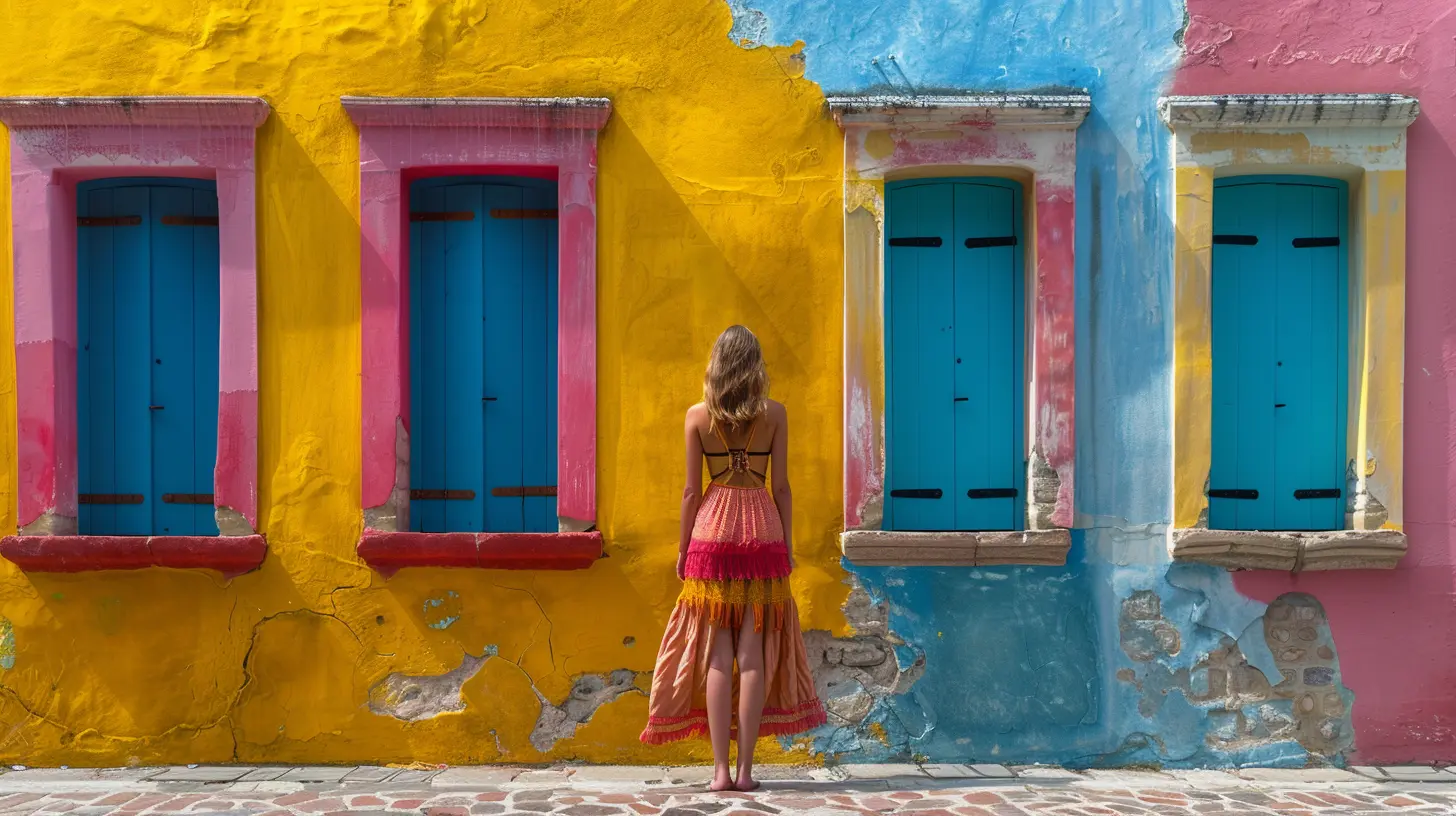
Why Does Color Matter So Much in Travel Photography?
Let’s be real: travel photography isn’t just about documenting places. It’s about transporting people. You want the viewer to feel the wind across the cliffs of Santorini, to taste the spices in a Moroccan souk, and to hear the hush of a misty morning in the Scottish Highlands.Color helps you do that.
Colors have psychological effects on people. Warm hues like red, orange, and yellow tend to evoke energy, excitement, and warmth. Cool tones like blue and green often bring feelings of calm, serenity, and even melancholy.
When you're conscious of how colors influence emotion, you can use that knowledge to shape your viewer’s experience of your photograph.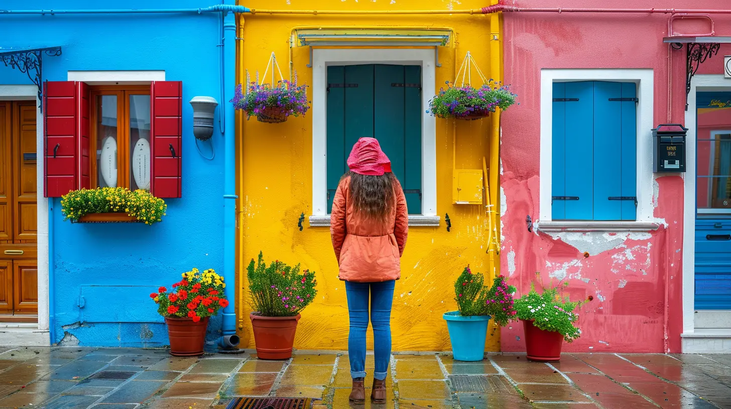
The Psychology Behind Colors
Before we get into camera settings and real-world examples, let's break down how different colors affect mood:? Red – Passion, Energy, Danger
Red grabs attention fast. Use it when you want to evoke excitement, love, or immediacy. Think of a striking red temple façade in Thailand or a crimson sari swirling in the wind.But be careful—too much red can feel aggressive. It's like spice: a little can elevate your frame; too much can overpower it.
? Orange – Warmth, Enthusiasm, Adventure
Orange is the color of sunsets, desert sands, and autumn leaves. It’s cozy yet thrilling, evoking a sense of adventure and creativity.Orange works beautifully in golden hour shots or bustling food markets. It’s the “hey, life is happening!” color.
? Yellow – Happiness, Optimism, Curiosity
Yellow is sunshine in color form. It calls to joy, spontaneity, and the thrill of discovering something new. Think of it in blooming tulip fields or pastel colonial buildings along Caribbean streets.Use it to add a pop of cheer or to break up more serious tones.
? Green – Peace, Nature, Growth
Green whispers tranquility. It tells of forests, rice paddies, and the gentle rhythm of rural life.Use green as a grounding force in your frame, especially when you want to soothe or calm your viewer.
? Blue – Calm, Sadness, Mystery
Blue is powerful. It’s the color of oceans, skies, and twilight. It can feel peaceful or melancholic, depending on how you use it.A cool, blue-heavy image can convey introspection or solitude—think glacial lagoons or foggy mountain mornings.
? Purple – Luxury, Spirituality, Magic
Purple is rare in nature, which often makes it feel exotic or even mystical. Use it to suggest something out-of-the-ordinary, like the pre-dawn haze over lavender fields or the glow of neon in a hidden Tokyo alley.⚫ Black, ⚪ White, and Greys – Simplicity, Drama, Balance
Neutral colors are your monochrome power tools. They can be dramatic, contemplative, or elegant, depending on how you combine them. They strip away distractions and often say, “Pay attention—this matters.”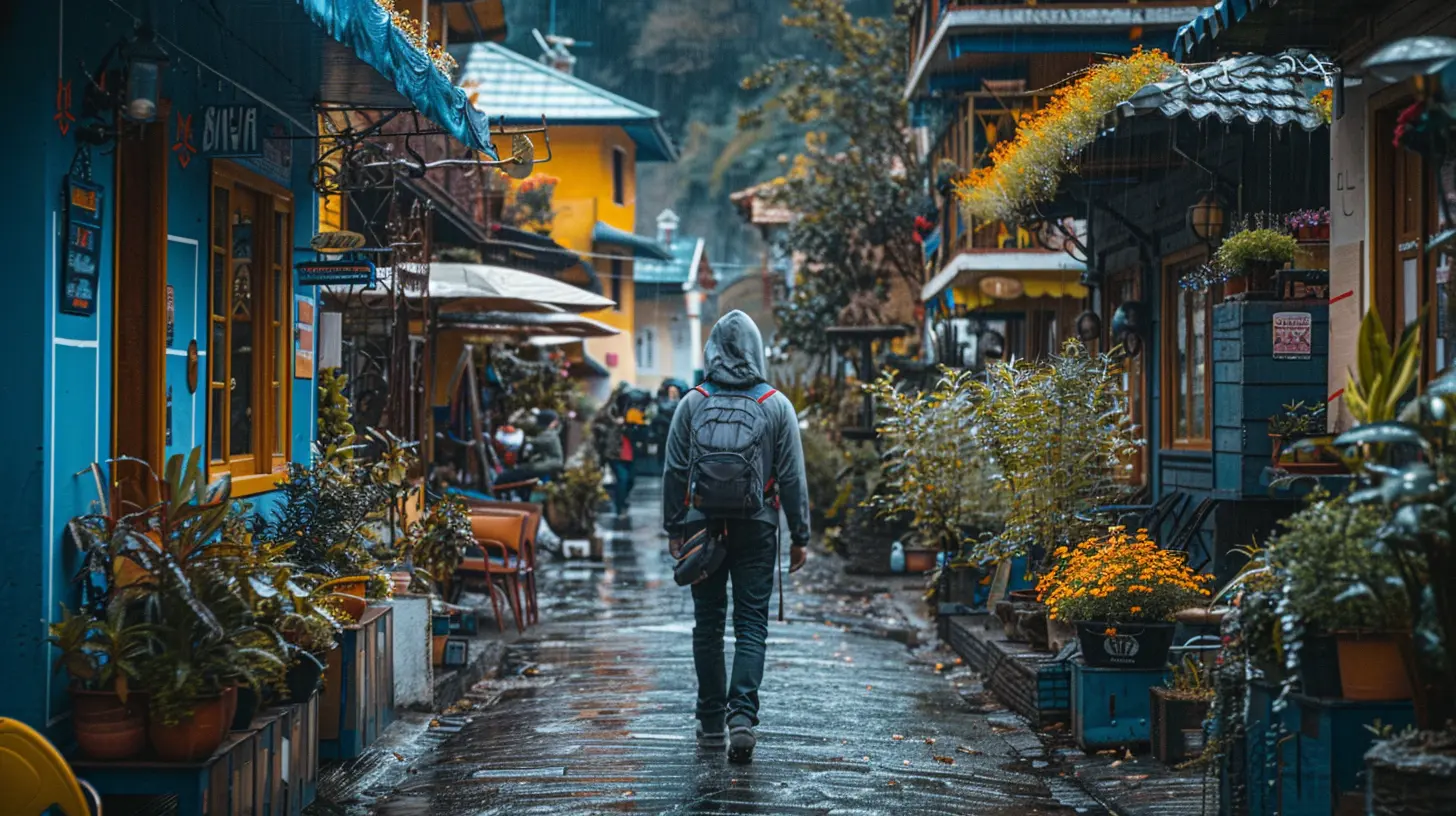
Composition and Color: How to Build Emotionally Charged Images
Let’s get practical. How do you actually use color to tell a story?1. Choose a Color Palette Before You Shoot
It sounds artsy-fartsy, but it’s gold. Before you even lift your camera, think: What emotion am I trying to capture here?Once you’ve nailed that down, choose colors that match.
For example, if you’re shooting a quiet village in Tuscany to evoke a slowing-down-of-time vibe, lean into soft, warm neutrals—browns, beiges, and gentle greens.
If you’re going for high-energy city life in Bangkok, look for high-contrast colors—vibrant reds, yellows, and electric blues.
2. Use Color Contrast for Impact
Photos come alive when there’s tension—and contrasting colors can create exactly that.Try pairing complementary colors (opposites on the color wheel) like blue and orange or red and green to make your subject pop.
A lone red kayak on a teal alpine lake? That’s visual poetry.
3. Tone and Temperature Matter
Shooting during the golden hour? Congratulations, you just unlocked the warm, honey-colored tones that make every scene feel nostalgic and magical.Shooting under a blue overcast sky? Prepare for cooler, moodier shots—great for moody mountain vibes or quiet coastal scenes.
The tone and temperature of your light affect the emotional temperature of your photo. Be intentional about it.
4. Desaturate for Mood
Sometimes, less color equals more emotion.Desaturated images—where colors are more muted than vibrant—often provoke introspection, solitude, or nostalgia. Think of a grey fog enveloping a mountain trail or a washed-out desert road leading nowhere.
You don’t always need full-blown color to make people feel something.
5. Leverage Color Blocking
Big swathes of single colors can be super powerful. Think of a monk in orange robes against a stark brick wall or endless blue windows across Santorini’s hillside.Color blocking simplifies your frame and makes the message loud and clear.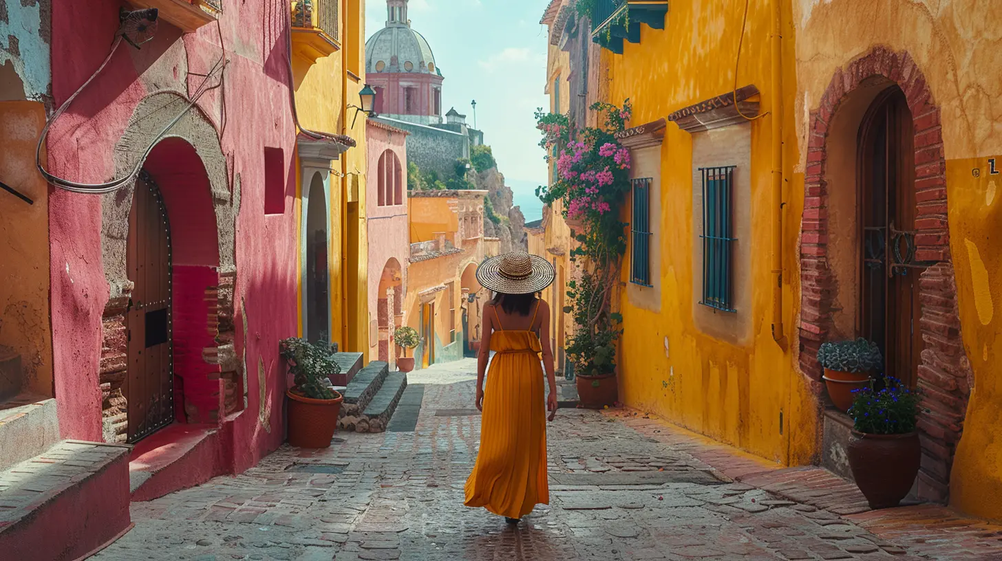
Editing: Where the Magic Happens
Let’s be honest—what you shoot in-camera is just step one. Post-processing is where your color story really comes to life.Use Presets Wisely
Presets are like seasoning. Good ones enhance the flavor without masking the dish. Choose or create presets that match the emotional tone you’re going for.Warm tones for joy and nostalgia. Cool tones for drama and depth.
Don’t Be Afraid to Teal and Orange
Yes, it’s a bit of a cliché in travel photography… but there’s a reason teal and orange are a classic combo: they mimic how our eyes see light and skin tones. Use this matchup to emphasize contrast and bring cinematic vibes into your work.Mind the Saturation
Over-saturated images scream “LOOK AT ME,” but can lose subtlety and depth. Under-saturated images whisper, but still say something rich and compelling.Find your voice somewhere in the middle.
Real-World Examples
Let’s look at a few real-life scenarios to see how color can completely change the mood of your travel photography.? Venice at Sunset
The city glows golden. The canals shimmer. The buildings reflect every shade of orange, peach, and pink. You feel warm and romantic just looking at it. You want to grab a gelato and hold someone’s hand.That’s color at work.
? Iceland in Winter
Blue ice caves. Grey skies. Stark white snow. It’s cold, it’s haunting, it’s otherworldly. You’re not just seeing a place; you’re feeling it.Again—color tells the story.
? Tokyo at Night
Neon magentas. Electric blues. Glowing greens. It’s like stepping into Blade Runner. You feel alive, wired, a little overwhelmed—and totally fascinated.That’s how color makes emotion visceral.
Tips for Developing Your Color "Eye"
Want to get better at seeing the emotional power of color when you’re traveling? Try these:- Practice monochrome: Shoot an entire photo series based on one color.
- Analyze your favorite images: What colors are dominant? What mood do they create?
- Study color theory: A little nerding out on how colors interact can go a long way.
- Create moodboards: Before a trip, collect images with a vibe you’re going for. Let them guide your color choices on the ground.
Final Thoughts: Color Is Your Secret Weapon
You don’t need the fanciest lens or the most exotic destination to capture stunning travel photos. What you need is intention.When you understand how to use color to evoke emotion, every image you take becomes more than a snapshot—it becomes a story.
So next time you’re out shooting, pause. Soak in your surroundings. Ask yourself, “What do I want someone to feel when they see this?” Then use color to whisper—or shout—that feeling into your frame.
Get bold. Get moody. Get colorful.
Your audience won’t just see the world through your lens—they’ll feel it.
all images in this post were generated using AI tools
Category:
Photography TipsAuthor:

Shane Monroe

